And was thinking about the game characters design evolution. I think it is funny that a character works for a game, make success then it just don't work anymore, need to updated. If Sonic got critized by his legs, what to say about Red? The Angry Bird main character?
I believe it was on Dreamcast that Sonic start growing long legs to looks cool.
If it was to follow the original design, the cover should be like:
 |
| fanart by Age-Velez |
Well. I'm Ok with creative freedom to design. But legs growing looks like a trend for Sonic haha
In the Angry Bird trailer I notice that the ball shaped bird grow up legs and "wings" (that is arms in reality). A humanoid bird like. Looks like when Tweety (Piu-Piu / Piolin) was turned into a monster in the Mr. Hyde episode:
Is this to be easier to make animations and stuff or to be closer to a Minion-like design and renew the brand? I don't know. And hell, is this kinda of a 'mischaracterization', isn't? I know that for human characters it is kinda easier to make an evolution. But it is really obligatory to RE-make the entire character if it will change media/hardware?
 |
| Polygon shaped to well human rendered looks a normal smooth evolution for Lara Croft |
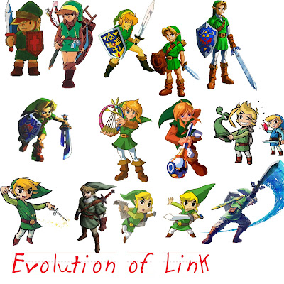
Nintendo evolute Link from Legend of Zelda series with a nice plot twist at some point. With a Cartoon version on it promotional stuff and in-game character also.
Ok! Another human shape. Let's think about...ugh... Jigglypuff? From Pokémon. Got a pretty smooth 3D conversion.
 |
| JigglyPuff on SmashBros |
And not a... AGH JESUS, my EYES!!
 |
| by SoupAndButter |
Ok that the real-plot-wise evolution kinda look like the actual design choice for angry bird... but this is not Jigglypuff anymore. It is a Wigglytuff. So.
 |
| A Wigglytuff |
Talking about Nintendo and Pink stuff, what about Kirby? Kirby started on GameBoy, as you may know, Gameboy is monochromatic. So at the beginning Kirby was kinda pale. With the evolution of console, GameBoy Colour and stuff. It got Pink. In Canvas Curse it got a ball shape to interact with lines users generated on the screen and move rolling. Kirby still stayed Kirby as we know. It was like Sonic turning into a ball to do his shit. Not like his limbs fall down or something out of the blue. And we have the Epic Yarn design that is my favourite. The original concept is still there, but it is completely different aesthetically. This is genius. :D
 |
| Hi, Comic Sans. :'( |
Welp. Who am I to judge? But I think if Angry Bird suits fine for T-shirts, games with a lot of styles... why not try and animation with a similar approach? The Red on Angry Bird movie looks like a monster. Not a bird. Thinking about the marketing, the products... Think about it as a "plushie"... This character looks 'huggable'? Ok... it is an ANGRY bird... but C'mon. Look how adorable the original concept looks like on this:
The original concept also looks neat with 2D animations:
Keeping the original design would work for an Angry Bird 3D animation?
Anyway, the movie looks ok to watch with your little fellows from family. Just wondering if this redesign was needed and how the marketing can gain or suffer with it. The Angry Birds is kinda saturated and the "Angry Birds 2" game didn't make a commercial triumph. The name can deceive too. Like it was the second game. There is Angry Bird of everything. Star Wars, Shakira, Racing, RPG... everything! Maybe this movie bring a new refreshing breeze to the franchise. Because thinking on the other side, with legs and arms/wings a lot of new game concepts can be made. Creativity freedom is valid, always. Let's see how it turns out for Rovio fellows. And what you think about it? Did you have a character killed by evolution? Or did it make the character more awesome yet?


No comments:
Post a Comment